Buckinghamshire Building Society
As a heritage brand, Buckinghamshire Building Society had moved from mainly offline marketing activity to running more digital campaigns. They were active in the mortgage broker space and were growing an audience on social media. They were also aiming to grow brand awareness in the wider Buckinghamshire community.
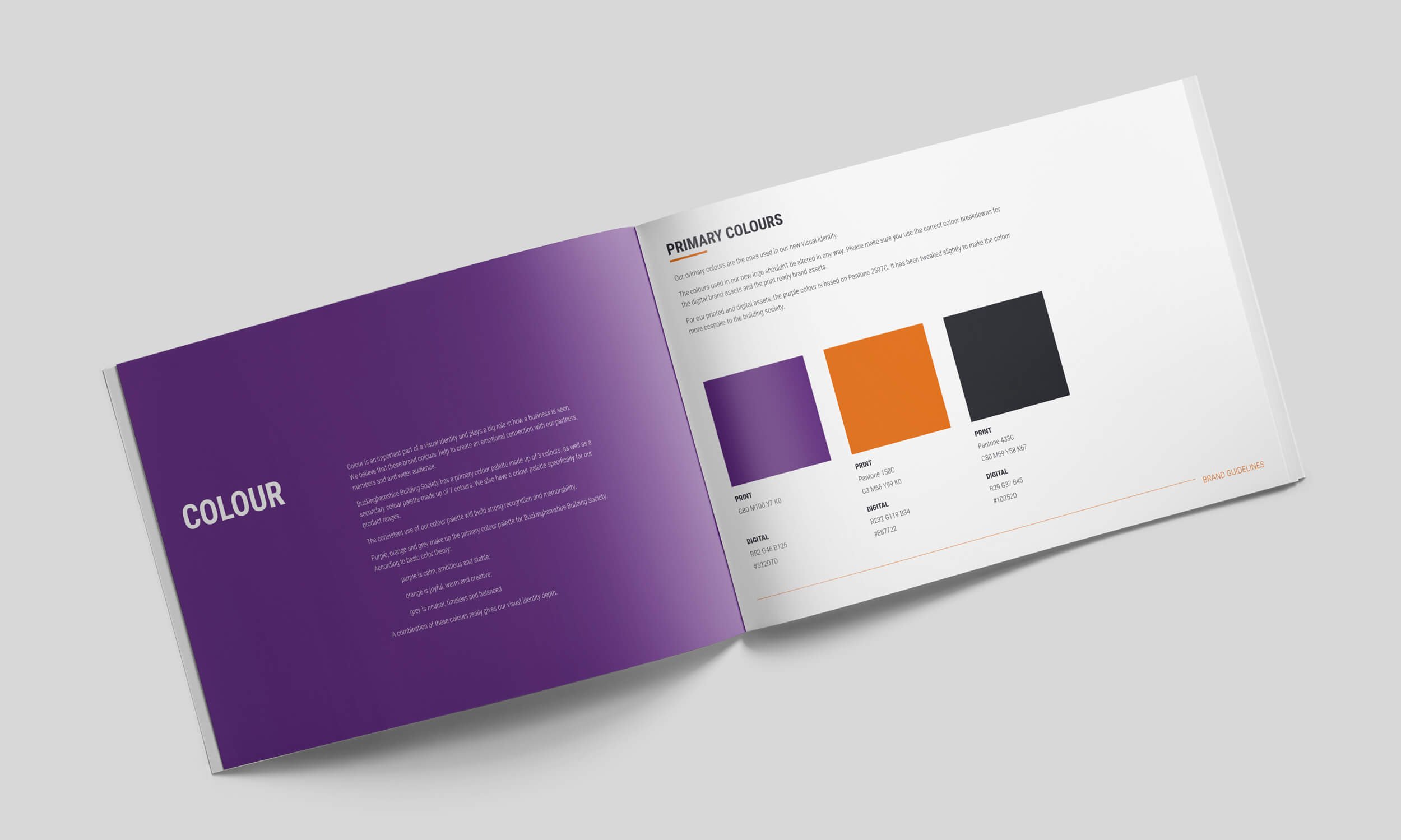
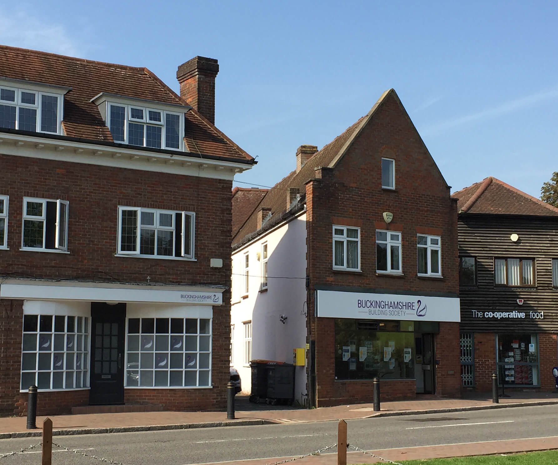
However, the client didn’t want a complete re-brand. They’d done some focus work with existing partners who said they liked the look and feel of the brand. The swan was also a key element of their logo and something that was to be retained as it is a well-known symbol of Buckinghamshire.
The challenge was to come up with a refreshed brand identity that was contemporary whilst staying to true to the roots of the Society.
You can read more about the work in my latest case study.
Logo Concepts & Rebrand / Design / Stationery Design / Brand Guidelines