The client
The Sickle Cell Society is the UK’s only national charity for people affected by sickle cell disorder. It was first set up as a registered charity in 1979, and since then the charity has been working alongside health care professionals, parents, and people living with sickle cell to raise awareness of the disorder. The Society’s aim is to support those living with sickle cell, empowering them to achieve their full potential. I first worked with the Society on their 2025 impact report, and that project led to this brand refresh.
The problem: a brand that only worked in one place
When a charity loves their logo, the worst thing a designer can do is rip it up and start again. So I decided I wouldn’t do that.
Their logo only really worked on a big black square. Anywhere else, it was awkward. It looked dated and it was hard to use across different materials.
The colour palette was also very limited. Orange and charcoal black is a strong starting point, but with nothing alongside it, every visual started to look the same. Stale isn’t a nice word to use about a charity doing important work, but it’s what the visuals were starting to feel.
The team loved their icon, though, and why wouldn’t they? It’s theirs. They didn’t want a complete rebrand, and they didn’t need one. The challenge was to make their brand easier to use and more professional, without losing what people already recognised.
The brief
Their aim was to introduce a refreshed brand identity that was more polished, modern, and infused with the warmth at the heart of the Sickle Cell Society. The update was a step forward in presenting themselves as approachable, committed, and dedicated to supporting everyone affected by sickle cell.
Keep the icon
Make the logo more versatile
Widen the colour palette
Make our typography more modern


The solution
A rebrand shouldn’t mean throwing away everything people already recognise. The icon stayed, and so did the primary orange and charcoal black. Instead of changing what was already working, I focused on what wasn’t working - the logo layout, the fonts and the lack of supporting colours.
I tidied up the logo layout, so it now works comfortably across materials instead of relying on one black square. I chose new fonts that look more professional and better reflect the charity and the work they do.
I also created a secondary colour palette to sit alongside the orange and charcoal. It gives their visuals real range, without losing the colours that make them recognisable. The new assets created were:
Refreshed logo layout for digital and print
New brand fonts
Secondary colour palette
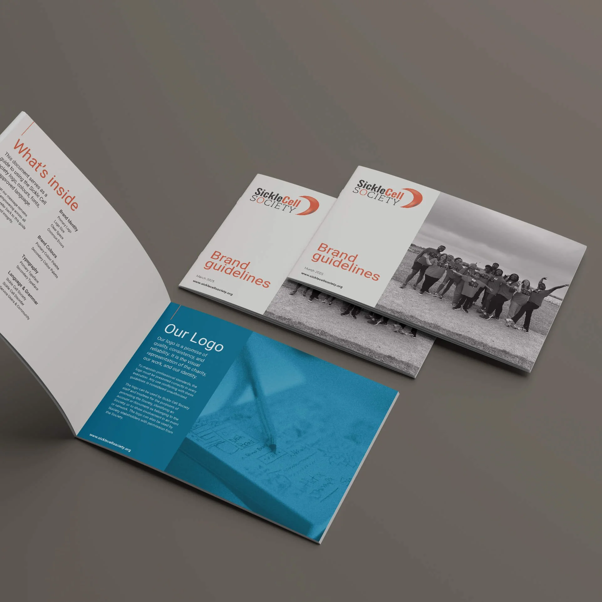
Brand guidelines
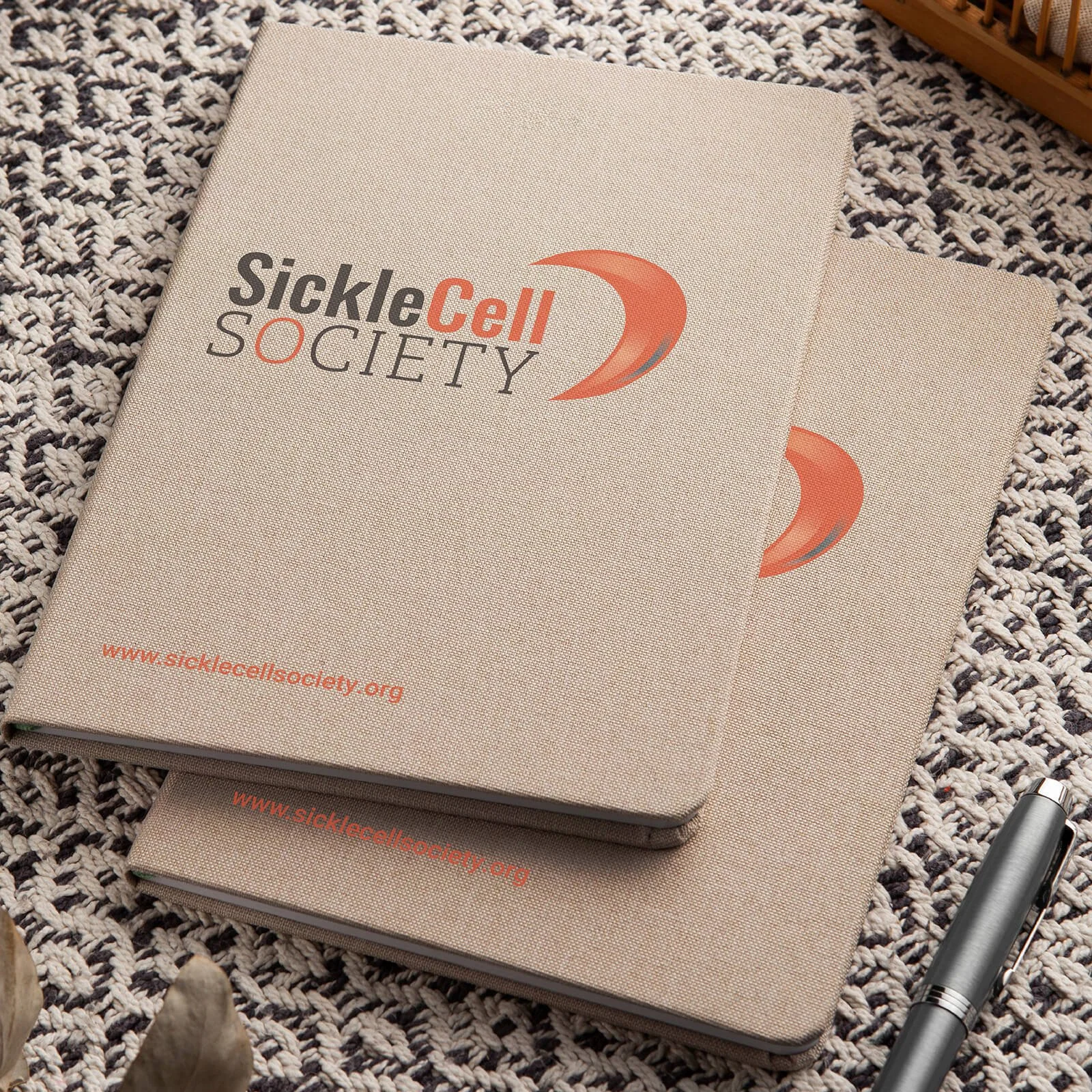
A mock up of the new branding on some notebooks
The proof is in the identity
This year’s impact report showed just how versatile the new identity is. The refreshed brand took out all the guesswork and made it so much easier to put together. There was a proper palette to work with, a logo that sat comfortably on the page, and clear rules to follow. Last time, we were working around the brand. This time, we were working with it.
It hasn’t stopped there either. The team has since been using the new logos and colours across their website and their social media posts, which is exactly what the refresh was for. A brand that’s easy to use gets used, and that’s how it starts to feel consistent.
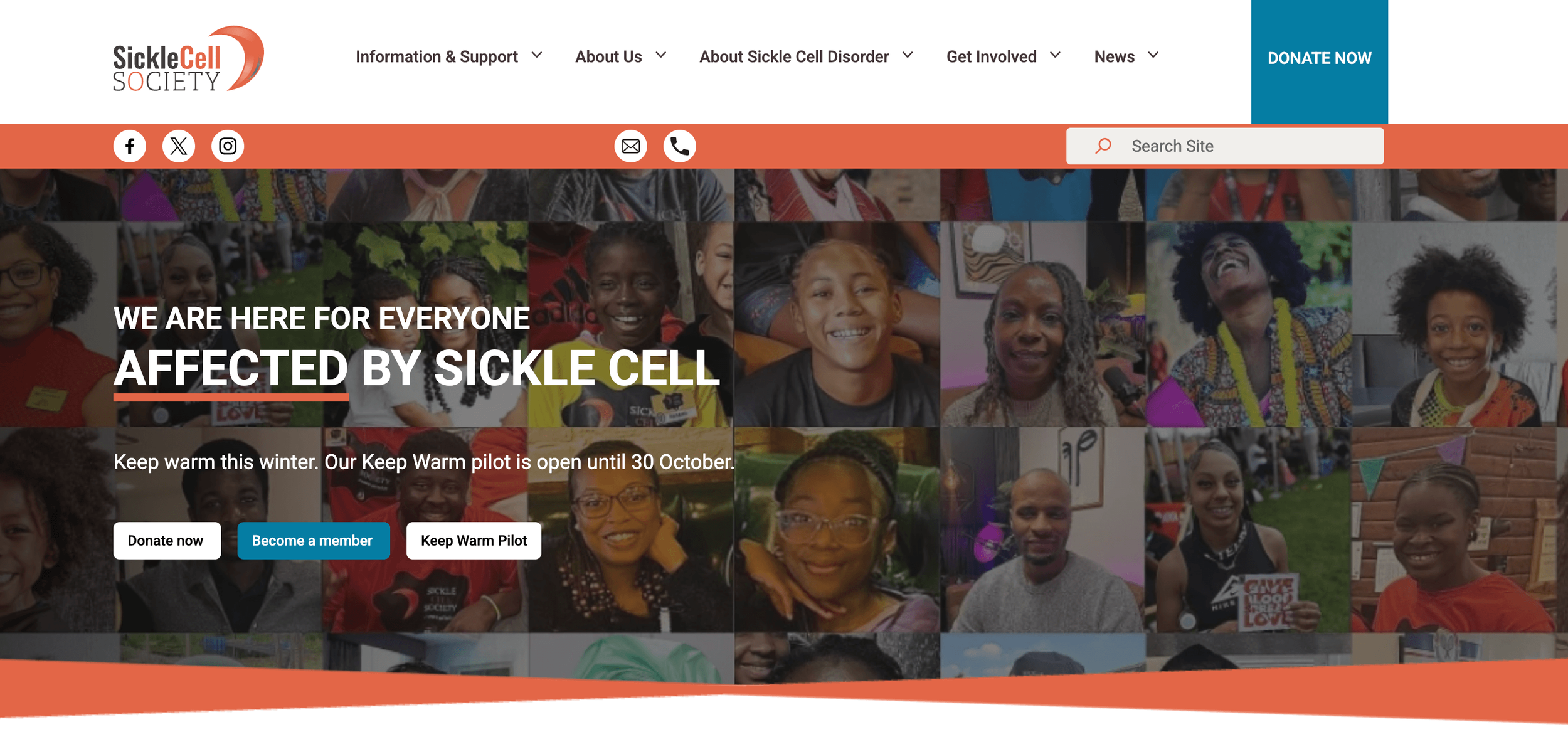
The new logo, colours and fonts in action on the Sickle Cell Society website
Let’s have a look at what’s working and what isn’t
If your brand is making your life harder, you probably don’t need a complete reinvention. Sometimes it just needs a good look at what’s working, what isn’t, and the courage to leave the good bits alone. If you’re not sure whether you need a refresh or a rebrand, I’m always happy to have that chat. Book a call!
I'll be posting more blogs, and case studies so be sure to check back here soon. Follow me on social media for regular updates, handy hints, tips and design inspiration! See you soon!