Buckinghamshire Building Society Rebrand

Buckinghamshire Building Society is a heritage financial services brand with deep roots in the local community. As the business grew its digital presence and social media activity, it became clear that the existing brand identity needed to work harder - both online and off. I worked with them to create a refreshed brand identity that felt contemporary and confident, while staying true to the society's history and values.
The Challenge
The society didn't want a complete rebrand; existing research showed that partners and customers had a genuine affection for the look and feel of the brand. The iconic swan, a well-known symbol of Buckinghamshire, was a non-negotiable element to retain. The challenge was to modernise the identity without losing what made it recognisable - walking the fine line between fresh and familiar.


The Solution
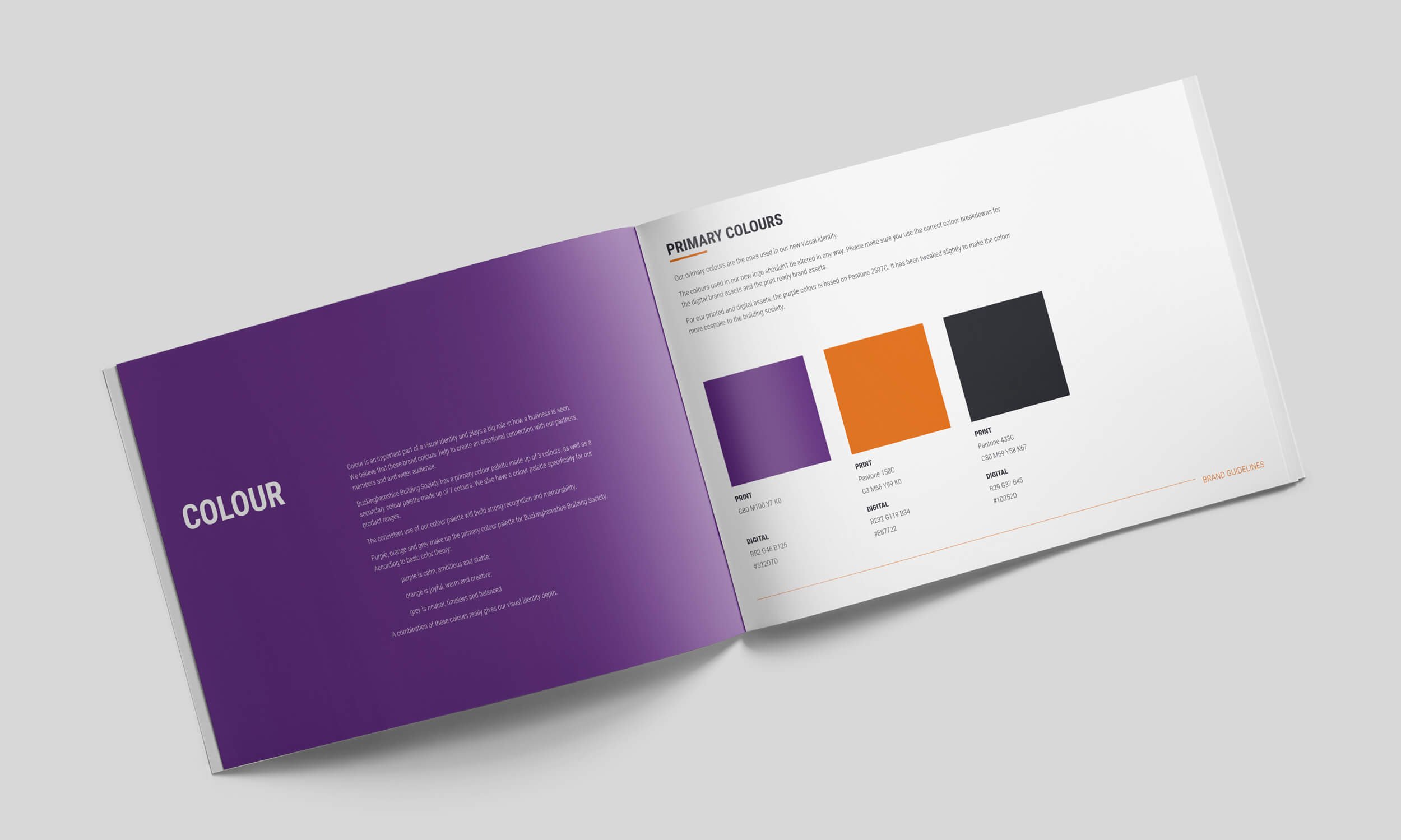
I developed a refreshed visual identity that honours the heritage of the brand while giving it a cleaner, more contemporary feel. The swan logo was refined rather than replaced, bringing it in line with modern design standards while retaining its familiarity. A refined colour palette and updated typography were introduced to give the brand more flexibility across digital channels, social media, and printed stationery, ensuring the identity could work consistently wherever the society needed it.
The Impact
The refreshed brand identity gave Buckinghamshire Building Society a visual toolkit that works confidently across both traditional print and modern digital platforms. By evolving rather than revolutionising the brand, the society retained the trust and recognition it had built with its existing audience while presenting a more polished face to new customers and mortgage broker partners. The result is a brand that feels both timeless and relevant.
Key Deliverables
Logo concepts & refinement - a modernised version of the iconic swan logo
Brand identity system - updated colour palette and typography for print and digital use
Stationery design - business cards, letterhead and branded materials
Brand guidelines - a clear reference document to ensure consistency across all touchpoints