Medical Practice Management brand identity
MPM provides highly experienced medical and medicolegal PAs to help consultants and therapists run efficient, cost-effective, and highly reputable private practices. I collaborated with Annabel and her team to create a brand identity that reflects the premium nature of their services and the seamless, high-level support they provide to medical professionals.
The Challenge
MPM operates in a niche, high-stakes environment where medical precision meets legal rigour. The existing brand needed to move away from a "general admin" feel and lean into a more specialised, executive identity. Annabel required a visual language that would immediately signal trust, discretion, and high-level expertise to busy consultants who are often cautious about outsourcing their practice management.
The Solution
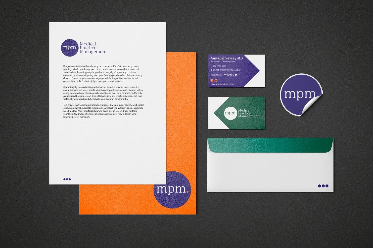
I developed a brand identity that balances traditional professionalism with modern efficiency. The visual system utilises a deep, authoritative purple as the primary anchor, symbolising trust and medicolegal expertise. This is contrasted with a vibrant orange and a sophisticated teal-green to create a dynamic, multi-dimensional feel that avoids clinical coldness.
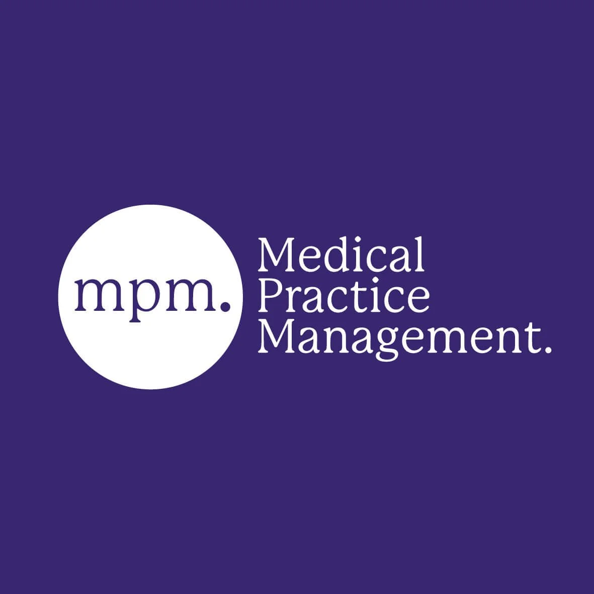
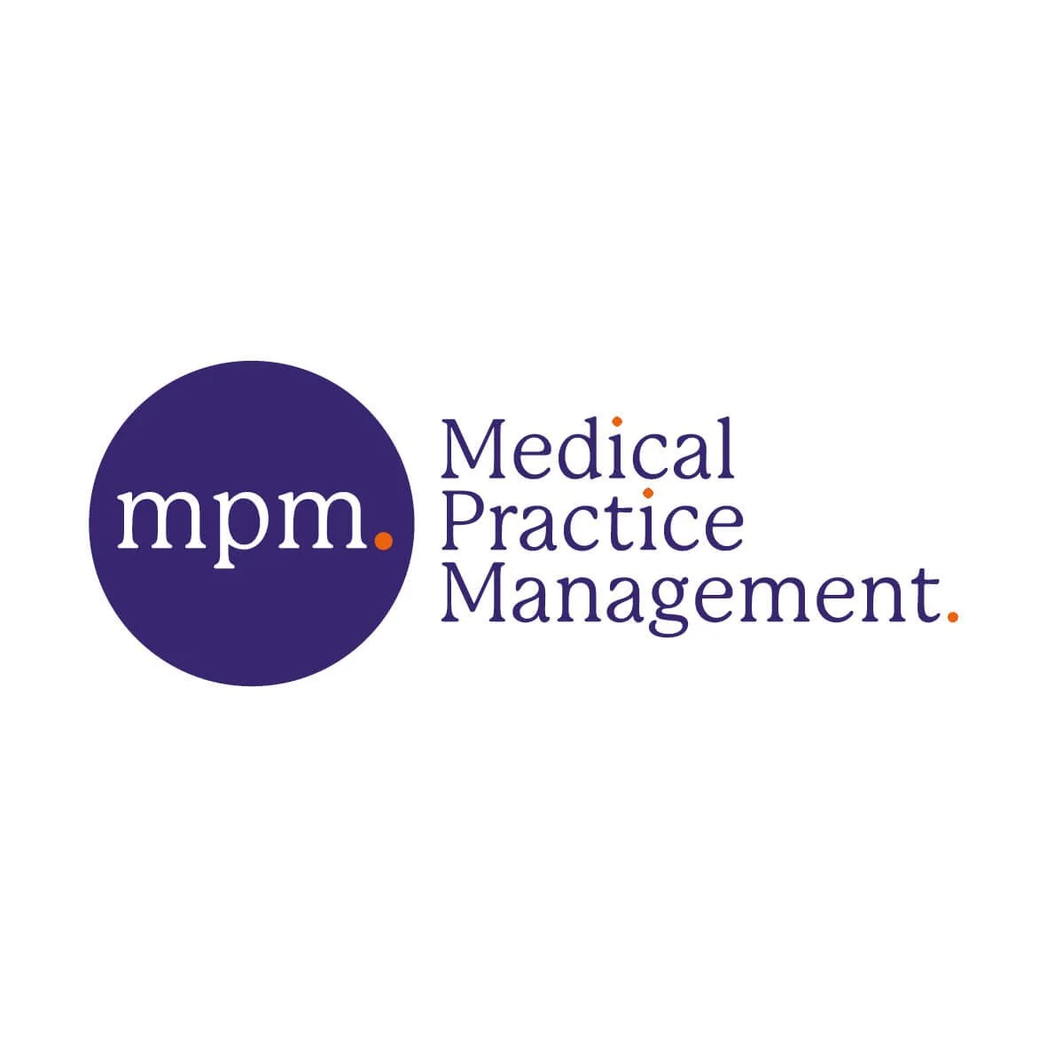
The logo features a clean, lowercase serif typeface encased in a circular seal, suggesting a "stamp of excellence" and a holistic approach to management. The use of geometric "arrow" motifs on the business cards subtly reinforces the idea of direction, progress, and moving a practice forward. The generous use of white space across the stationery suite reflects the clarity and organised mindset MPM brings to their clients.
The Impact
The final brand identity provides MPM with a professional toolkit that matches the high calibre of their consultancy. By modernising their visual presence, the practice now feels more aligned with the executive level of the consultants they support. The result is a cohesive, recognisable brand that communicates reliability and efficiency from the first business card exchange to the final piece of formal correspondence.
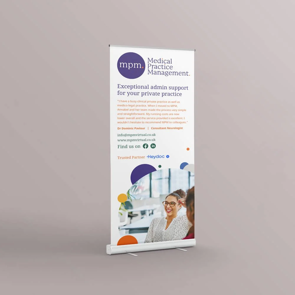
Key Deliverables
Visual identity: a versatile logo system and a sophisticated colour palette designed for high-end professional environments.
Stationery suite: formal letterhead that maintains a clean, organised aesthetic for medical correspondence.
Business cards: a dual-colour card system using bold geometry to create a memorable first impression.
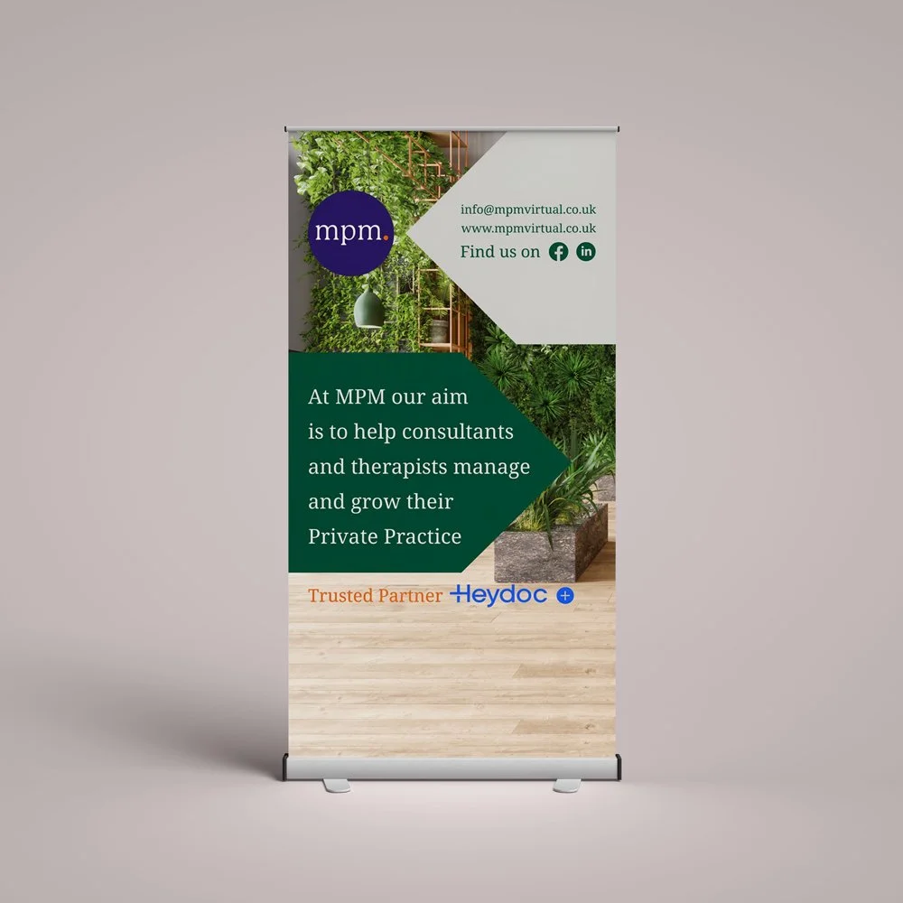
Banner stands: high-impact exhibition graphics designed for medical conferences.