
One-Two Digital brand identity
One-Two Digital is a digital marketing agency and consultancy for SME business owners, helping them grow through PPC, paid social, SEO, affiliate marketing and more. Based in Leeds, they're a small but mighty team with a big reputation built almost entirely on referrals, long-term client relationships, and results that speak for themselves.
The Challenge
One-Two Digital operate in a crowded space where a lot of agencies look and sound identical. They wanted a brand that would rise above the clutter — one that felt bold without being brash, friendly without being unprofessional, and memorable without resorting to gimmicks. The goal was for potential clients to look at the brand and think "I can trust these people and I want to work with them."
Founder Laura is a passionate football fan, and One-Two is a direct nod to the classic quick-pass move used to unlock a defence and create space. But it runs deeper than that. It also reflects the back and forth nature of how she works with clients - a genuine two-way relationship where both sides support each other. The brand needed to carry both layers of meaning, quietly and cleverly, without shouting either of them.
The Solution
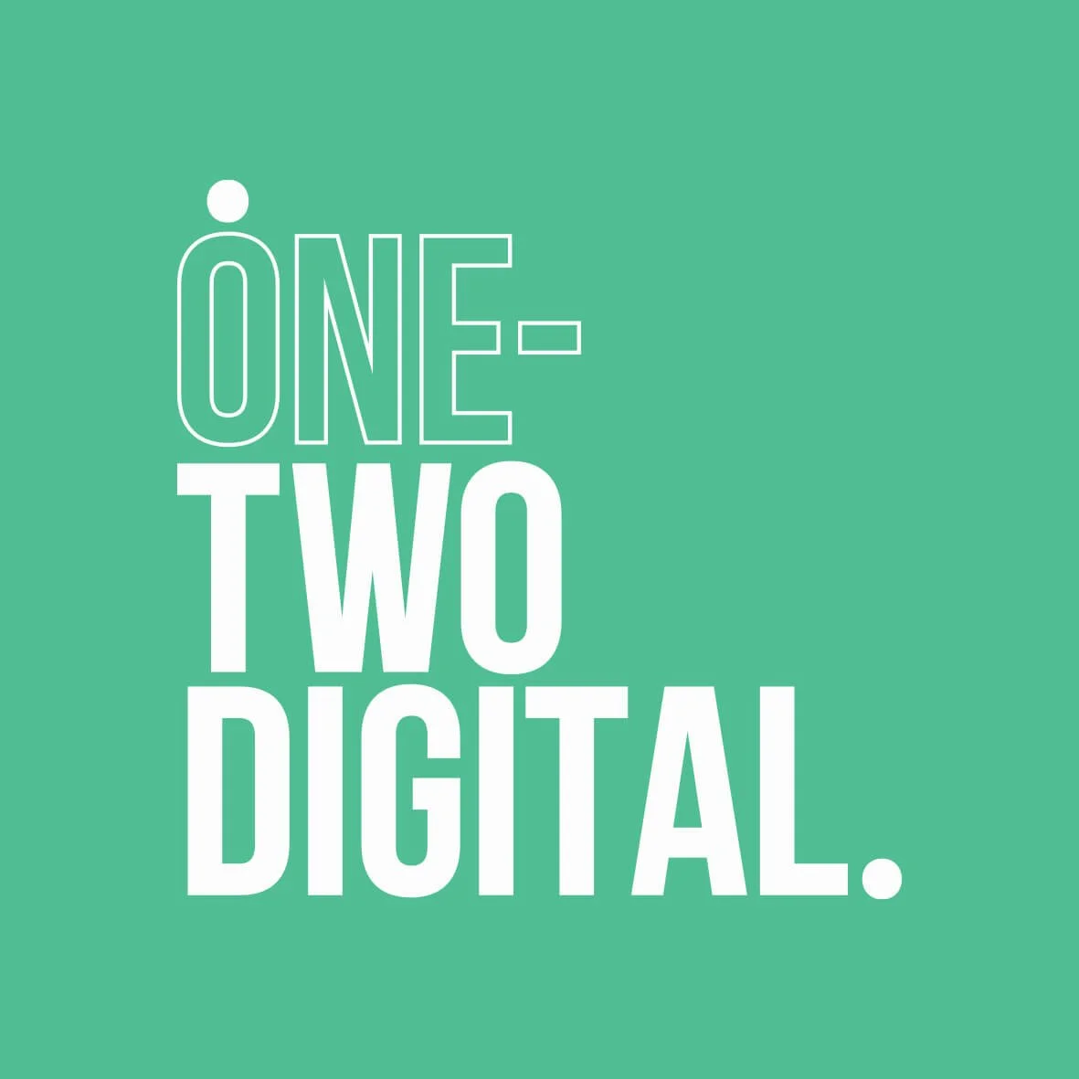
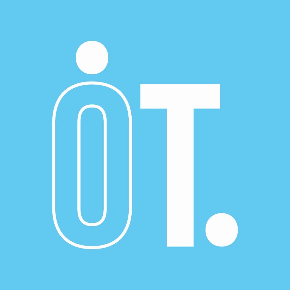
At the heart of the identity is a logo built around two circular shapes, a subtle nod to Laura's love of football and the one-two move that inspired the name. It's the kind of detail that rewards those in the know, without alienating anyone who isn't.
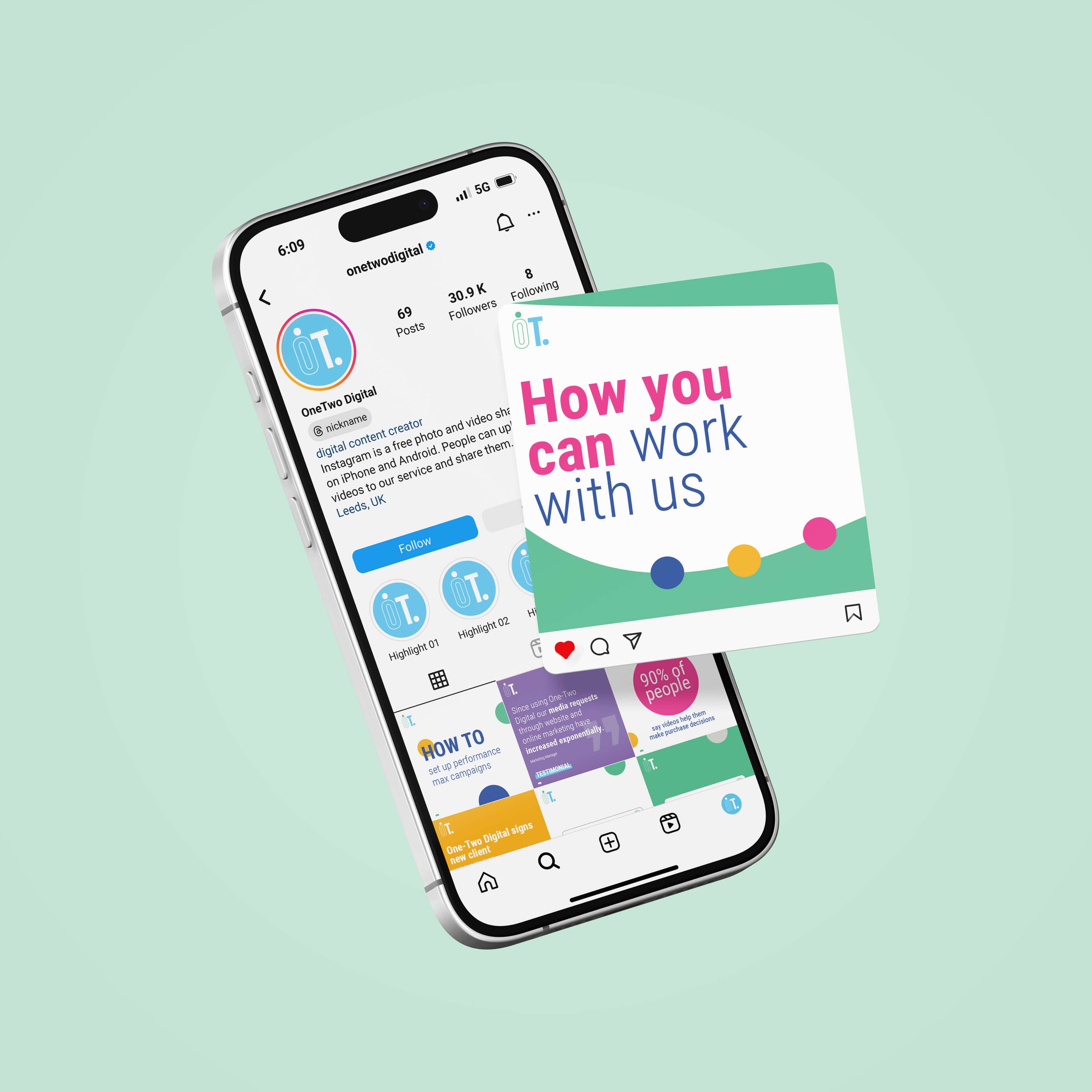
The circular form then becomes the backbone of the entire visual system. Circles of varying sizes and colours float through every touchpoint, social templates, carousels, headers, creating an identity that feels dynamic and alive rather than static and corporate. They work decoratively, but they also work hard - containing stats, framing imagery, anchoring layouts.
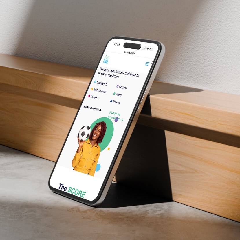
The colour palette is bold and unapologetically vibrant, spanning green, magenta, yellow, navy and purple, with enough flexibility to switch between background colours while staying
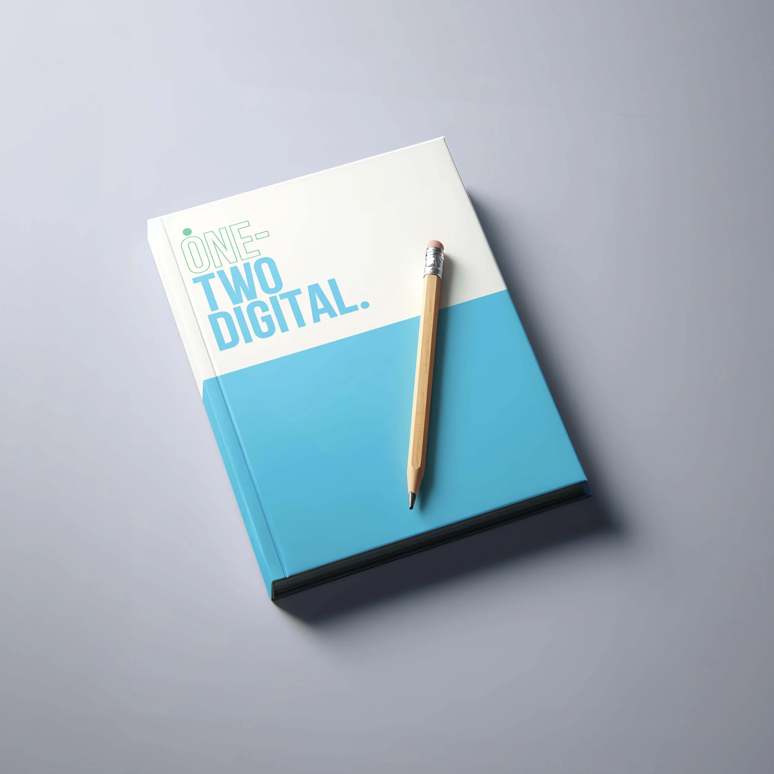
on-brand. Paired with tall, commanding typography, the overall identity feels confident, energetic, and a long way from the sea of identikit agency brands it needed to stand out from.
The Impact
One-Two Digital now have a brand with real presence and real personality, one that looks and feels like an established, trustworthy agency rather than a small company still finding its feet. A brand that matches the quality of work they've been quietly delivering for years, with client relationships that average three years and some going back almost six.
Key Deliverables
Logo & brand system: full visual identity including logo, colour palette, typography, brand guidelines, and supporting graphics
Word document templates: proposal, letterhead, and template guide
PowerPoint templates: reporting and proposals
Social media templates
Brand icons
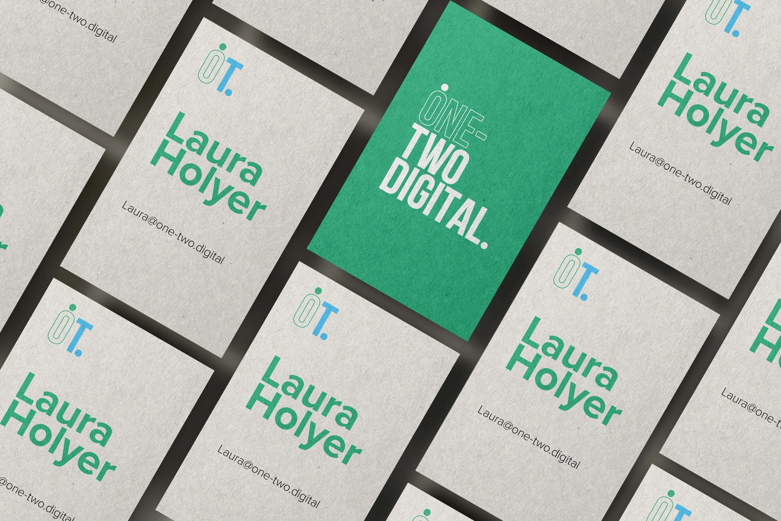
Business cards